

 0
0

Jykel Sig Process
Most Important
Obviously the first thing you need to do is think what your end goal is (what you want to achieve eg. theme), but once you've thought of it, the absolute most important thing is research/preparation. This part usually takes the longest time. Just research a little bit every night on the subject matter (I know it's not exciting), but it's important not to rush into it - preparation is key. Even if it's inspiration of things people have created... things that 'you' like... the more research you do, the better prepared you are before you start to put it together. The last thing you want is for it not to work and all that time being wasted.
For Jykel's sig, he's into his Anubis so it was just a matter of simply sourcing reference images from the internet. I just use Google, simple as that.
Here's the images I used (Note: They are all reduced in size):
Used this image for reference to shape of head.

Used this image for reference to sword shape and some small details.

Now that you've/I've sourced some reference images, the second most important thing is approach. How you're going to put it together. For this case, I just used Illustrator to draw up a shape that I was relatively happy with. Keeping it basic for now as you don't want to spend too much time on the details in case it turns out shit. I just drew the outline of the head, and one side only, then flip it as it's mirrored. Ended up with the following.

Then I simply took each piece of the above outline and started to put it into Photoshop so I could add textures and details. For the textures I just searched for reference images of armour. Here's the two images I used. Note: These are the same techniques used to create textures for concept art, 3d and games.


So I'd just copy bits of the armour textures and paste them into the pieces of the outline I brought into Photoshop. I might then need to warp or reshape them a little and pull some of the saturation out. Because it's the same shape on both sides, I just work on the face and one side then flip it (like above - as there's no point in doing the work twice).

I also add some colour (in certain areas) using blend modes and colour overlays, a subtle lens flare to the eyes ( which you can either use PS brushes or a program like this http://www.brainfeve...lareStudio.html [I think it's only for Mac though] ), shadows and bevels etc to give it a bit more depth - finally I just sharpened it to bring out the texture details... but other than that, that's it.
So with that said, the main two things really are research and approach. Another thing is to look at the sig as simply as possible. Don't try to over complicate it. Then, it only really takes basic Photoshop knowledge to create them. Probably the main things you should understand is how to use layers, masks, some of the default (soft and hard) brushes, blend modes, effects like bevel and drop shadow and Image Adjustments like Hue/Saturation and Levels.
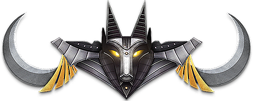
Here's the final (just in case Jykel stops using it)

As said, any questions, let me know - happy to help.
Next, I'll do a quick rundown on how I did my one which was a completely different approach.


 ati, on 05 September 2014 - 07:25 PM, said:


 .
.




 Screen Shot 2014-09-07 at 6.38.39 pm.png


 " );
_last = ipsLightbox.lightboxImage.src;
}
}
/* Check for init and then keep checking for new image */
_to = setTimeout( "gbl_addDownloadButton()", 1000 );
}
//]]>
" );
_last = ipsLightbox.lightboxImage.src;
}
}
/* Check for init and then keep checking for new image */
_to = setTimeout( "gbl_addDownloadButton()", 1000 );
}
//]]>